


Why iPhone has two ways to answer calls
A deep dive into Apple’s intentional UX Design


The phone rings
Today we’re dissecting a micro-moment you’ve probably experienced but rarely questioned: Why does your iPhone sometimes ask you to “slide to answer,” and other times give you tappable buttons?
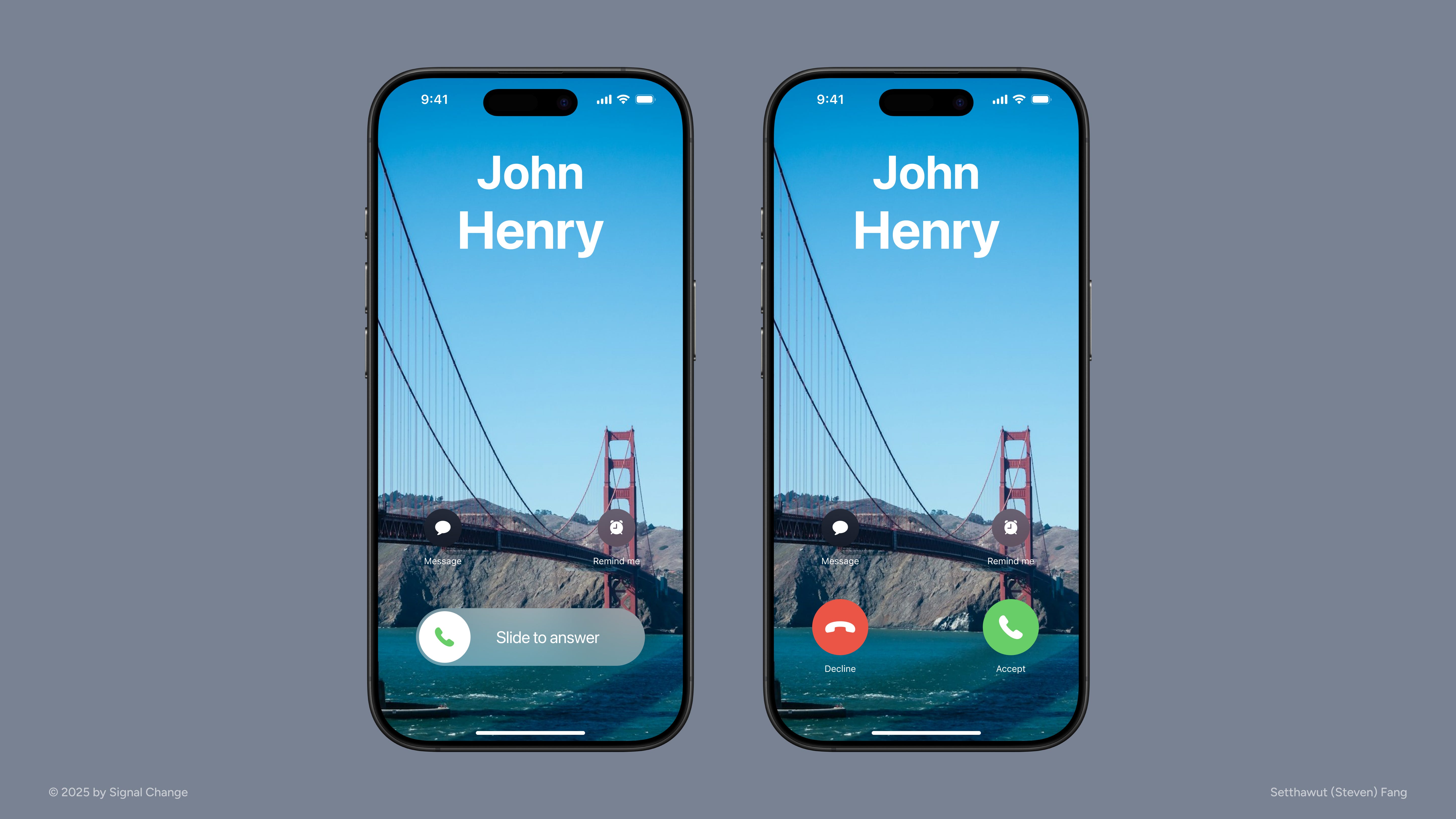
When the screen is locked, you must swipe to answer. But when you’re already using the phone, green and red buttons appear for you to tap. It’s not a glitch. Apple’s dual-approach to answering phone calls is designed intentionally to align technology with human behavior through thoughtful design.
The why behind the how
Apple’s design choice hinges on context: your level of engagement with the device.
Locked (slide to answer):
A swipe requires deliberate physical effort, reducing the chance of accidental answers from pockets, bags, or curious toddlers.
It taps into physical intention—swiping requires more effort, signaling you genuinely want to answer.
The interaction mirrors the old “slide to unlock” feature, anchoring to muscle memory.
Unlocked (tap accept/decline):
When you’re already using the phone, speed and ease take priority.
A simple tap offers a frictionless path to action, respecting the user’s current focus and attention.
Behavioral science in action
Humans are prone to errors, especially when distracted. Apple’s decision to use a swipe gesture when the screen is locked is a textbook case of error prevention through interface design. Requiring a deliberate swipe introduces physical friction that requires just enough effort to minimize accidental pickups, like those caused by pocket touches or a child playing with your phone. It ensures that answering a call is an intentional act, not a mistaken one.
The interface also responds to contextual signals. When your phone is locked, you might not even be aware of the incoming call, so the system increases both interaction effort and sensory signal strength. For example, with Attention Aware Features enabled, the iPhone can detect if you’re looking at the screen. If so, it lowers the ringtone volume to reduce disruption. But when the phone is locked, the ringtone plays at full preset volume, helping to catch your attention even if the phone is across the room or buried in a bag.
Cognitive load also plays a role. A ringing phone interrupts your current task, and the brain’s decision-making capacity narrows. Offering just one clear action like “slide to answer” minimizes mental effort and helps users respond more clearly and confidently.
Finally, the swipe gesture draws on anchored familiarity. Long-time iPhone users remember the iconic “slide to unlock” motion. Repurposing that action taps into muscle memory, reinforcing a sense of intentional control. That continuity makes the interaction feel natural, intuitive, and trustworthy.
UX psychology at play
Several core behavioral principles shape this small but powerful interaction:
Interaction consistency and muscle memory matter. Apple borrows from its now-retired “slide to unlock” gesture to make “slide to answer” feel instantly familiar. Familiarity builds user trust and reduces hesitation.
Fitts’s Law explains why a swipe (slower and more deliberate) helps prevent mistakes. When tapping is more appropriate (unlocked screen), Apple uses it to reduce friction.
Hick’s Law reminds us that the fewer the choices, the faster the response. In both locked and unlocked states, the call UI presents only what’s necessary, keeping the interface focused and intuitive.
Activation energy is applied subtly. A swipe adds just enough friction to ensure users are making a conscious and intentional choice.
Loss aversion underpins the design too. When answering a call might interrupt an activity or lead to an unwanted interaction, Apple’s added friction helps users avoid the potential “loss” of time, focus, or control.
Together, these micro-decisions converge to reduce risk and boost user confidence, all within the span of a single incoming call.
Micro‑moments with Macro Impacts
Beneath your fingertips, a behavioral science story is unfolding every day. Apple’s dual-answer design cleverly adapts to human behavior, optimizing for intent, context, and attention. It’s a powerful reminder that sometimes the smallest micro-interactions and moments can have an outsized impact on user experience.
Thanks for reading,
Steven
If you enjoyed this reading
📥 Don’t forget to subscribe (If you haven’t already done so), so you won’t miss out on anything!
❤️ Like the post
💬 Share your thoughts down in the comment section below.
🦋 Refer Signal Change to the people in your circles.
🙏 If you find the content valuable, consider paid subscription to Signal Change to gain access to exclusive contents that are only available to the paid subscribers. There are group discounts, gift options, and referral rewards available.
☕️ Support my work by buying me a couple cups of coffee as a token of appreciation.
🤝 Connect with me over at LinkedIn.